Another useful pictorial is the stem‐and‐leaf. It is similar to a histogram in that it shows the range of data, where the data are concentrated, if there are any outliers (occasional extremely high or extremely low scores), and the general shape of the distribution.
For example, look at the following data—test scores of 17 high school students: 69, 75 , 77, 79, 82, 84, 87, 88, 89, 89, 89, 90, 91, 93, 96, 100, and 100. The stem‐and‐leaf takes all but the last digit of each score as the stem and uses the remaining digit as the leaf.
As an example, for the score of 69, the 6 is the stem and the 9 is the leaf; for the next three grades (75, 77, and 79), 7 is the stem, and 5 , 7, and 9 are the leaves.
Note, too, that along the extreme left side of the chart is a vertical column that keeps a running count or total. (Some stem‐and‐leafs do not include this running total.) Having a running total enables the reader to quickly locate the median.
The completed stem‐and‐leaf for the high school students' test scores looks like Table 1.
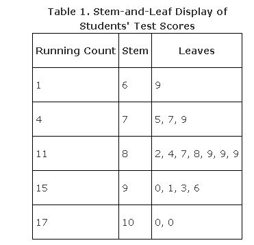
Notice that, like a histogram, each stem determines a class interval and, also like a histogram, the class intervals are all equal. (In this case, each interval width is from a possible low of 0 to a possible high of 9.) All 17 scores are displayed in the stem‐and‐leaf so that you can see not only the frequencies and the shape of the distribution but also the actual value of every score.