Introduction to Graphic Displays
Displaying categorical data in simple graphical formats such as bar charts and pie charts
Displaying quantitative variable data in simple graphical formats such as dot plots, frequency histograms, and stem‐and‐leaf plots
Using box plots to display numerical measures of data
Interpreting graphic displays to make conclusions about the distribution of the variable
Understanding scatter plots
Pie charts and bar charts are graphic displays of data for categorical variables. Dot plots, stem‐and‐leaf plots, histograms, and box‐and‐whisker plots are graphic displays of data for numerical variables.
As an example, consider the yearly expenditures of a college undergraduate. After collecting her data (expense records) for the past year, she finds the expenditures shown in Table 1.
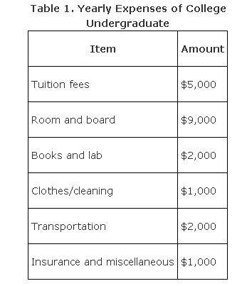
These figures, although presented in categories, do not allow for easy analysis. The reader must expend extra effort in order to compare amounts spent or relate individual proportions to the total. For ease of analysis, these data can be presented pictorially.