One of the more commonly used pictorials in statistics is the frequency histogram, which in some ways is similar to a bar chart and tells how many items are in each numerical category. For example, suppose that after a garage sale, you want to determine which items were the most popular: the high‐priced items, the low‐priced items, and so forth. Let's say you sold a total of 32 items for the following prices: $1, $2, $2, $2, $5, $5, $5, $5, $7, $8, $10, $10, $10, $10, $11, $15, $15, $15, $19, $20, $21, $21, $25, $25, $29, $29, $29, $30, $30, $30, $35, and $35.
The items sold ranged in price from $1 to $35. First, divide this range of $1 to $35 into a number of categories, called class intervals. Typically, no fewer than 5 and no more than 20 class intervals work best for a frequency histogram.
Choose the first class interval to include your lowest (smallest value) data and make sure that no overlap exists so that one piece of data does not fall into two class intervals. For example, you would not have your first class interval be $1 to $5 and your second class interval be $5 to $10 because the four items that sold for $5 would belong in both the first and the second intervals. Instead, use $1 to $5 for the first interval and $6 to $10 for the second. Class intervals are mutually exclusive.
First, make a table of how your data is distributed (see Table 1). The number of observations that falls into each class interval is called the class frequency.
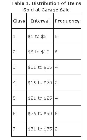
Note that each class interval has the same width. That is, $1 to $5 has a width of five dollars, inclusive; $6 to $10 has a width of five dollars, inclusive; $11 to $15 has a width of five dollars, inclusive; and so forth. From the data, a frequency histogram would look like what you see in Figure 1.
Figure 1.Frequency histogram of items sold at a garage sale.

Unlike in a bar chart, the class intervals are drawn immediately adjacent to each other.
|
|
|
|
|
|