Sometimes you want to display information about the relationship involving two different phenomena. These data would be called bivariate or paired data. For example, suppose you collected data about the number of days that law‐school candidates studied for a state bar examination and their resulting scores on the exam. The data from eight candidates is shown in Table 1.
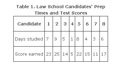
One dot would then be plotted for each examinee, giving a total of only eight dots, yet displaying 16 pieces of numerical information. For example, Candidate 1 studied for seven days and received a score of 23. Candidate 1's dot would be plotted at a vertical of 23 and a horizontal of 7 (see Figure 1).
Figure1 .A representative point of data on a scatter plot.

A completed scatter plot would look like Figure 2.
Figure 2 .A scatter plot displaying the relationship between preparation time and test score.

There is a strong positive relationship between the number of days studied and the score on the bar exam; that is, the data displayed indicates that an increase in days studied for the exam correlates with an increase in score achieved. A negative relationship would be indicated if the dots suggested a line going down from left to right, meaning that as one variable increases, the other decreases. And no relationship would be indicated if the scatter plot dots suggested a completely horizontal line, a completely vertical line, or no line at all (see Figure 3).
Figure 3.Scatter plots that display no relationship between the variables plotted.

These relationships are discussed in more detail in Chapter
, which discusses bivariate relationships.
|