Line graphs convert data into points on a grid. These points are then connected to show a relationship among the items, dates, times, and so on. Notice the slopes of the lines connecting the points. These lines show increases and decreases. The sharper the slope upward, the greater the increase. The sharper the slope downward, the greater the decrease. Line graphs can show trends, or changes, in data over a period of time.
Example 1
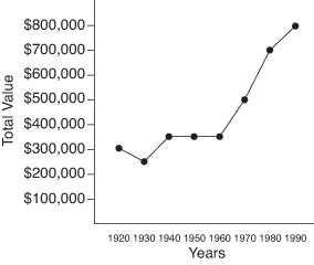
Based on the line graph shown in Figure 1,
1. In what year was the property value of Moose Lake Resort about $500,000?
2. In which ten‐year period was there the greatest decrease in the property value of Moose Lake Resort?
1. The information along the left side of the graph shows the property value of Moose Lake Resort in increments of $100,000. The bottom of the graph shows the years from 1920 to 1990. Notice that in 1970 the property value was about $500,000. Using the edge of a sheet of paper as a straightedge helps you see that the dot in the 1970 column lines up with $500,000 on the left.
2. Because the slope of the line goes down from 1920 to 1930, there must have been a decrease in property value. If you read the actual numbers, you notice a decrease from $300,000 to about $250,000.
Figure 1. Line graph showing the property value history of Moose Lake Resort.
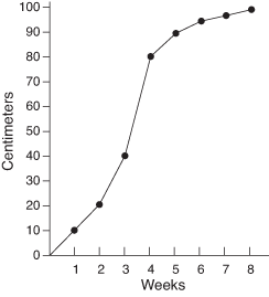
Example 2
According to the line graph shown in Figure 2, the tomato plant grew the most between which two weeks?
The numbers at the bottom of the graph give the weeks of growth of the plant. The numbers on the left give the height of the plant in centimeters. The sharpest upward slope occurs between week 3 and week 4, when the plant grew from 40 centimeters to 80 centimeters, a total of 40 centimeters growth.
Figure 2. Line graph of a tomato plant's growth.